Did you know that most people are influenced by the colors of the logo when choosing a product?
Colors play a very important role in our lives. Our preference of colors depends on several factors, such as our current mood or superstitions. In addition, the meaning of colors varies from one culture to another.
1 . What are the advantages of colors?
In your opinion: “why do you think using the right colors for a product has such advantages?” and “why do we most often recall the logo of a product we saw moments ago while we have trouble finding the brand name?”
For this topic you can also read: “Image is the message“.
Research shows that consumers form an opinion within 90 seconds of their first interaction with a product. Approximately 62-90% of this judgment is based on color alone (Singh 2006).
So, is the choice of color palette also important in web design? The answer is of course yes. Colors are also paramount in digital design. By choosing the proper colors that match your brand, you can take advantage of all their benefits. The right usage of colors not only increases the time visitors spend on your website, but also makes it easier for them to remember your brand.
Developing a well-planned approach to color usage is both a challenge and a necessity for digital design.
2. Define a color marketing strategy
In order to define a strategy for color marketing, you must first ask yourself the following question: Who are you? Where do you want to place your brand? Who is your target audience?
Above all, remember that the colors you choose for your website should be consistent with your logo and the images you use on your social media accounts.
When defining the color scheme you’ll use on your site, you’ll want to consider the gender, age, education level and income of your target audience.
Create a couple of matching palettes for yourself. Basically, each color you use should appear in several places on your website.
Colors should be consistent with respect to:
- your logo ;
- your header;
- your titles ;
- your drop down menu ;
- your background ;
- your buttons (especially the action buttons);
- and your footer.
Depending on your target audience, you can choose 5 or 6 soft or dominant colors, or compatible or contrasting colors on the same scale.
3. The colors that speak for you
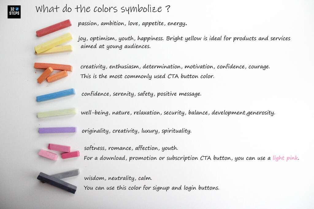
Colors help you convey your message.
Some tips:
The best choice of colors for your brand’s call-to-action (CTA) button corresponds to the mood of your customers to make a purchase or to consult your offers/services. If your product is an offer made to tourists, related to relaxation and well-being, you may prefer a blue or a light green background. This choice of colors, in perfect harmony with the search of your potential customer, facilitates her/his choice and can thus reduce her/his search time on the web.

On the other hand, you can also choose a bright red or orange if you aim at an immediate purchase from your visitors for the products or services you offer.
Of course, not everything is “black and white” to guide your potential customer in his choice, hence the importance of developing a strategy.
When choosing the background colors, please also pay special attention to the choice of text color so that it remains visible and readable.
4. Check your colors
Test your colors. By regularly checking page view statistics, you can measure what your visitors like. Let your users determine the colors of your website. You can make your website more user-centric by simply playing with shapes and colors without changing the content.
Références
- Singh, Satyendra (2006) Impact of color on marketing. In : Management Decision, vol. 44, n° 6, p. 783–789. DOI: 10.1108/00251740610673332.
- W. Swasty and A. R. Adriyanto, “Does Color Matter on Web User Interface Design?”, CommIT (Communication & Information Technology) Journal 11(1), 17–24, 2017
If you found this article useful, please share it.
Do you have any questions? Please leave a comment or contact us at the email address below.


